Saturday 18 February 2012

Digipack analysis - Britney Spears

This is the front cover for Britney Spears' ' My Prerogative: Greatest Hits' digipak. it just shows Britney wearing black leather shorts, a black lace bra and a fur jacket. The cover also has lace effects which matches her lace bra, but other than that I think the lace detail is a bit random. Her name and title of the album is at the top right corner. I thought it was creative how they used a stamp effect on the text, which perhaps shows that the album is supposed to be relaxed and striped back compared to her previous albums. The running colour scheme throughout the digipak is grey,which might represent nostalgia since it's a greatest hits digipack.


 This is the bonus remix CD which comes with the digipack. The remix disc shows a collage of all her previous CD covers which, as i've said, shows that this digipack is a nostalgic look after career. I guess is the point of greatest hits CDs, to look back at all the achievements an artist has made. I obviously can't use this example for my digipack, but I really like this collage idea.


This is the normal CD which is very simple. It has the lace effect which is on the front cover but this is a lighter version.

Magazine advert analysis - Ashlee Simpson

This advertisement of Ashlee Simpson's ' I Am Me' album is quite moody, dark and gothic. The image of her shows her wearing a black tule dress, which goes with the rocky/gothic theme of her entire image.  Also, she is wearing black eyeliner which goes the theme. So this shows they carefully thought about her image and made sure everything links to one another. The font for her name is a typical gothic font and the font for the album's name looks like someone's handwriting, which makes the album seem more personal. All the text is white which contrasts with everything else which is black. It says that when people buy her album, they will get a free necklace from Claire's. This appeals to Ashlee Simpson's target audience as the majority of them are teenage girls.

This advert also goes well the her music video for ' Boyfriend', which is also dark and moody. This shows that her management really thought about her image from the promotional posters to her music videos, and this basically proves that image is extremely important for pop artists.

Magazine advert analysis - Kings of Leon

This magazine advertisement of Kings of Leon just has a blurry picture of what i assume is a beach since there are palm trees and sunlight. The title of the band is at the top in a big font. The title of the tour or album is in the same font and colour except a bit smalller so that the artist's name stands out more. The release date of the poster is in a similar font but it's slightly transparent whereas the other texts are white.  The title ' Come Around Sundown' fits in with the beach/sun theme of the poster. I think it's a really simple but effective poster. The poster also looks vintage, like it was made in the 60s which also goes with the indi image that Kings of Leon have. Most artists tend to use images or a lot of graphics on their posters to attract attention, so I think it's kind of refreshing to see a simple image with minimum effects used. I also like how it doesn't show the band which suggests that maybe they want the focus to be on the music rather than their image, unlike most other pop artists.

Final video!

VIDEO HERE!


Monday 6 February 2012

Editing Process


Here are a few notable effects we used in Final Cut Pro. 


This is a split-screen/square box effect we used for the drug scenes. It was a good idea to use this effect to show both seperate times the girl buys drugs and how desperate she is. 


We used a blurry effect on the scene where the girl takes the drugs to emphasis her state of mind and how dizzy and high she is. It was quite straight-forward, all we had to do was go on effects, video filters, and blur. 


For the sunset sequence, the actual footage was too long to include in the video so we decided to fast forward it by modifying the speed. This particular scene wasn't inspired by, but reminded me of ' Waiting For Tonight' by jennifer Lopez. 


This overlaping images was used to show that the girl is going crazy and losing her mind. This particular scene was inspired by a Bow Wow video where he was losing it. 


This is a proper split-screen we used near the beginning of the video. It was inspired from Destiny's Child's ' Emotions' and we wanted to use this effect for a long time so this was a perfect opportunity, to show two of the characters side by side. Notice one side of the split-screen is darker than the other. This is to symbolise the nature of their troubles, one girl is having relationship/love problems and the other is having drug addiction problems. 

The process of filming.


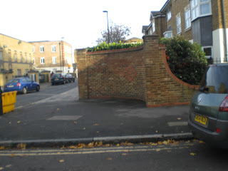
This is the brick wall in which Fatiat's ( our actress) character will be waiting to buy drugs off a drug dealer. I thought this would be a good place to do this scene because there's not a lot of activity in this area and it looks like a dodgy, isolated place where there's not a lot of people to see her buy the drugs. Obviously this would me more realistic than a crowded high street.


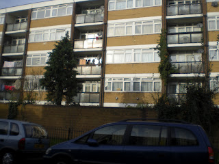
These are pictures of the surroundings to show how quiet and deserted the area is. This was not only relevant for the actual scene, but it was useful for us because we didn't have any interruptions. 


This is another brick wall which our character buys another batch of drugs from a different drug dealer. Both scenes are infront of brick walls because for some reason, there is something dodgy about brick walls. 

We were going to shoot a scene here but decided against it

This is a map to the park which was useful for us.


These were the souroundings of the area of the park in which we filmed in. As you can see it wasn't busy at all.


This is the pathway where we filmed the girl walking.

We wanted to shoot a drug related scene in this

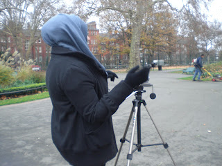
 These are pictures of us filming a particular scene. It looked like a fairly simple shoot but it took us quite a while to get the right angle and shots we wanted.

This is one of the shelters we used for one of our sequences


Here is our shooting schedule: